Considerations for web component and custom control design:
If your control has the stuff below covered, excellent! If not then please implement it before shouting to the world about it being the next big thing. Or at least document its deficits and provide a health warning that the control is incomplete and not fit to use in production.
| design consideration | description | Yes/No |
|---|---|---|
| focusable | Can you get to the control via the keyboard? Refer to Providing Keyboard Focus | |
| keyboard operable | Can you use the control with the keyboard? Refer to Keyboard Navigation | |
| touch operable | Can you use the control with touch gestures? With assistive technology enabled? | |
| expected operation | Can you operate the control using the standard keys (Refer to ARIA Widget Design Patterns) and/or touch gestures for the control type? | |
| clear indication of focus | Can you easily see it when the control has focus? Refer to Visible Focus (WCAG2) | |
| label | The control has a text label that is exposed as an accessible name in accessibility APIs | |
| role | The control has an appropriate role exposed in accessibility APIs | |
| states and properties | The control has any UI states and properties that it has exposed in accessibility APIs | |
| color contrast | The control label/description/icon is perceivable/usable for low vision users (Use a color contrast checker.) | |
| high contrast mode | The control is perceivable/usable when High Contrast Mode is enabled (e.g. Windows HC mode) |
Take note:
The ARIA design patterns provide a most excellent and comprehensive set of requirements, for expected keyboard interaction and what role, state and property information needs to be exposed, for a large variety of custom controls.
Accessibility APIs
If the term accessibility APIs has you scratching your head, read Why accessibility APIs matter by the one and only Marco Zehe.
The accessibility tree
Tree of accessible objects that represents the structure of the user interface (UI). Each node in the accessibility tree represents an element in the UI as exposed through the accessibility API; for example, a push button, a check box, or container.
Example baseline test using the native HTML button element
Most of the considerations listed below do not need to be checked for a native HTML button as you get them for free (thanks to the browser implementers). If you build a custom control (for example, a custom button web component) you need to add most of this stuff yourself.
| design consideration | description | Yes/No |
|---|---|---|
| focusable | Using a test file attempt to tab to the control. (except when it is disabled) |  |
| operable | Using a test file attempt to make something happen (except when it is disabled) | |
| expected operation | Buttons have standard expected keystrokes (enter or space) that will make something happen. Using a test file ensure that controls works as expected. (except when it is disabled) | |
| indication of focus | Using a test file, can you see the control is focused? (except when it is disabled) | |
| label | Default method for providing an accessible name for button is via text content child of button element (there are others, whatever you use you you need to end up with an acc name exposed). You can check it using aViewer or other accessibility object inspection tool. | |
| role | Default role for <button> is already provided by browser (role:button). You can check it using aViewer or other accessibility object inspection tool | |
| states and properties | The control has any UI states and properties that it has exposed in accessibility APIs. Standard states and properties for <button> are already provided by browser (focusable, focused, unavailable [if disabled attribute used). You can check them using aViewer or other accessibility object inspection tool. | |
| color contrast | Check that contrast between the label/description/icon and its background is perceivable/usable for low vision users. Use a color contrast checker. | |
| high contrast mode | Most OS’s have a high contrast mode. Windows High Contrast Mode for example. enable the high contrast preference and ensure that controls are still understandable. | |
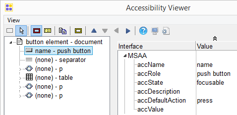
aViewer
Obect Inspection tools such as aViewer can be used to test that your custom controls are exposing the correct information via accessibility APIs.
Some Other Object inspection tools:
- Dom Inspector (free Firefox extension)
- Inspect.exe (free desktop application for windows available as part of the Windows SDK)
- Accprobe (free open source desktop application)
- Accessibility Inspector (free Mac appplication)
- You can view a dump of the accessibility tree in chrome by typing
chrome://accessibility/in the address bar.
A personal opinion
UI accessibility is not an accessory, a ‘nice to have’. If a UI is not accessible it’s incomplete, substandard, half baked – a neckbeard UI
— Steve Faulkner (@stevefaulkner) August 14, 2014
Further reading
- What ARIA does not do
- Notes on notes (of smart people) about web components
- Using the tabindex attribute
- Building an Accessible Disclosure Button – using Web Components
- disclosure-button custom control
- HTML5 accessibility implementation support in browsers